Volkssternwarte München
Redesign
As a redesign of the observatory has been planned for some time, I was invited to join the project team and have been responsible for the design aspects of the observatory since then. So far, this project includes a new website, the logo, a brochure, and membership cards. As the observatory is a highly traditional and well-established organization, it was crucial for this project to preserve the existing identity to a considerable extent within the new design.

Altes Design der Webseite
Typography and Logo Redesign
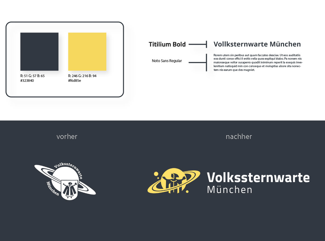
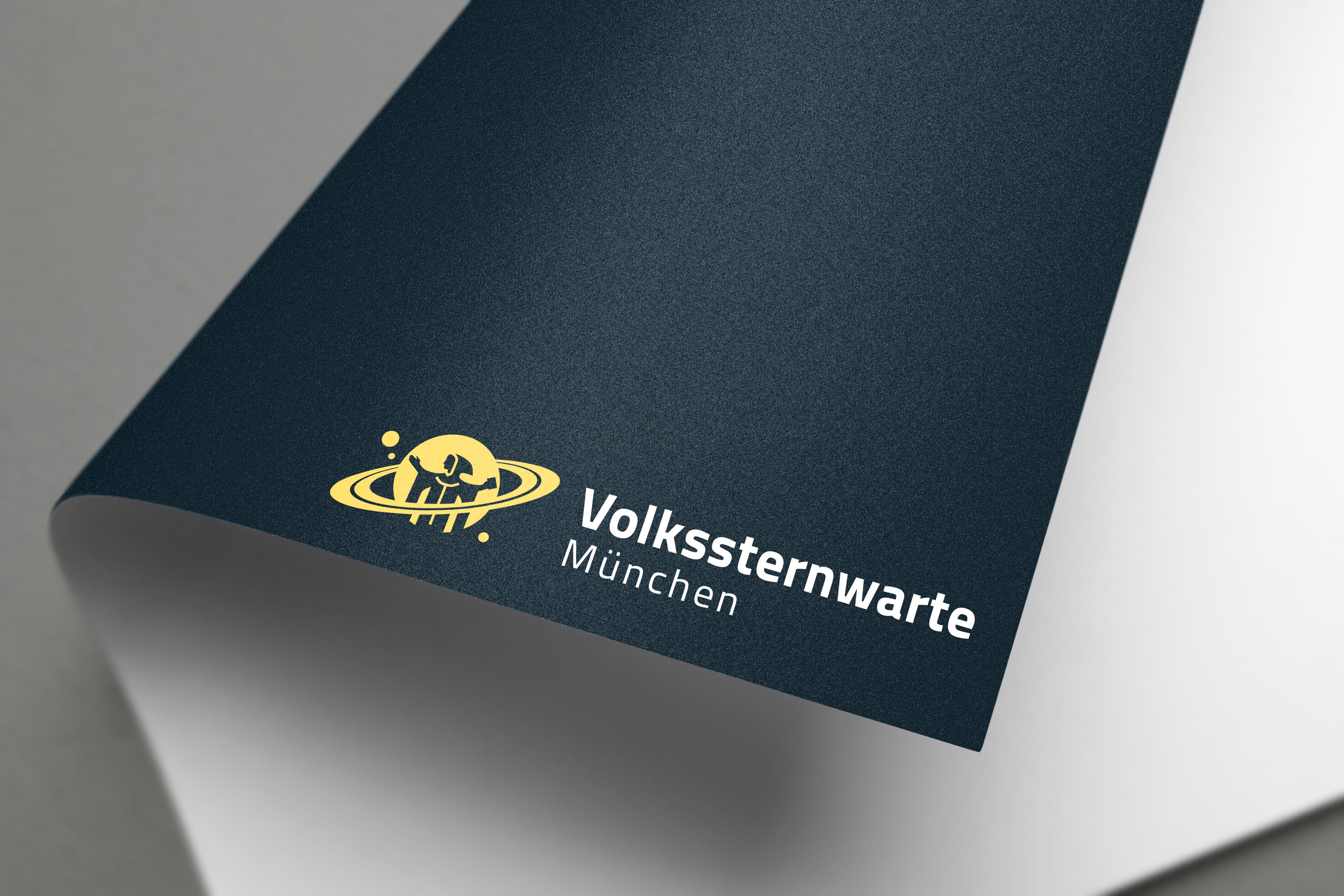
In the context of the redesign, the logo was also modernized. The old logo consisted of a depiction of Saturn overlaid with the coat of arms of the Munich Child (Münchner Kindl). The Munich Child is part of the coat of arms of the city of Munich, making it an integral part of the identity as a Munich-based association and the history of the observatory. The task was to simplify the logo to enhance its scalability.
To achieve this, the Munich Child was separated from the coat of arms, and its forms were reduced while maintaining a more realistic representation, resulting in a higher level of recognition related to the city's emblem. Now, the Munich Child points to one of the numerous moons that orbit around Saturn.
Instead of curving the text around Saturn, it is now placed on the right side to ensure better readability. The tilt of the ring was adjusted to create a more harmonious white space between the image and wordmark.

WEBSEITE
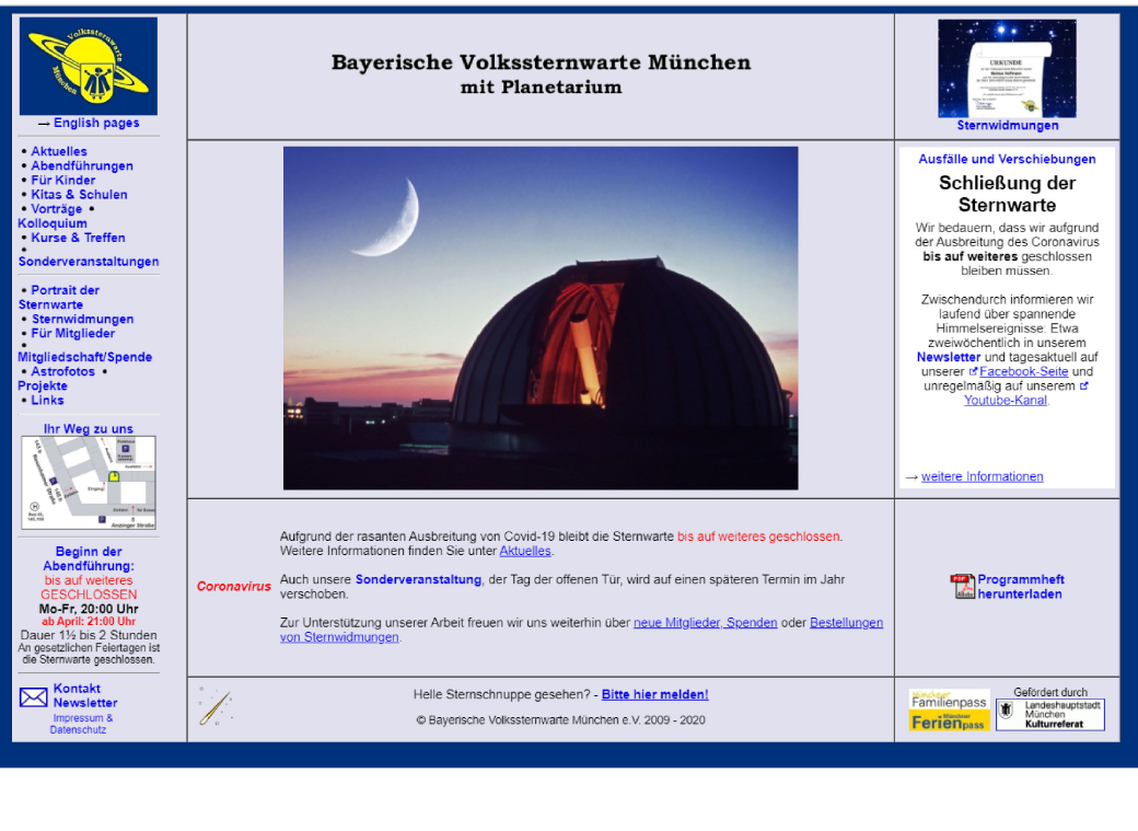
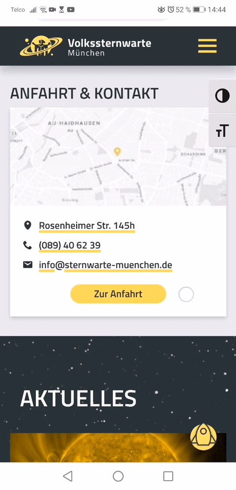
As part of the redesign of the Volkssternwarte München (Public Observatory Munich), the website was also revamped. The previous website of the observatory had been designed and implemented by the observatory's staff a while ago. However, it lacked a unified system in terms of structure, fonts, images, and logos. Additionally, it was built on a poorly maintainable codebase. As a result, the overall impression was not up-to-date for the association's public representation.
In collaboration with representatives from the Volkssternwarte and the agency MMC, a website design was developed and implemented. The agency MMC was responsible for implementing the designs that I had created in cooperation with the observatory. Special emphasis was placed on enabling easy content management for the observatory's staff, which is why Wordpress was chosen as the foundation. Consequently, the design was structured in a modular layout with a consistent and unified design.
You can visit the live version at www.sternwarte-münchen.de.

Due to the large volume of content on the website, it was necessary to quickly navigate to the top of the page. A static button designed as a rocket effectively met this requirement.
Furthermore, it was a special concern to implement accessibility features such as adjustable font size and options to increase contrast.
Membership Card
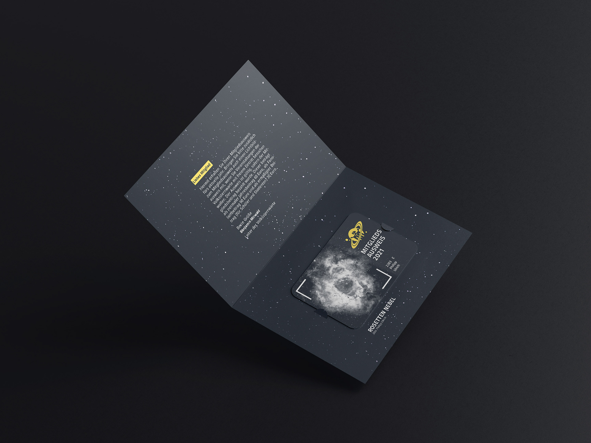
Every year, the members of the observatory receive a new membership card, which allows them to use the telescopes free of charge. Previously, it was a simple card with a changing background color and the members' information listed on it.
In order to establish a stronger visual connection to the observatory, I replaced the changing color scheme with a field where an astrophotograph taken by one of the members of the astrophotography group can be inserted. This way, there is a new astronomical object serving as a "mascot" each year.
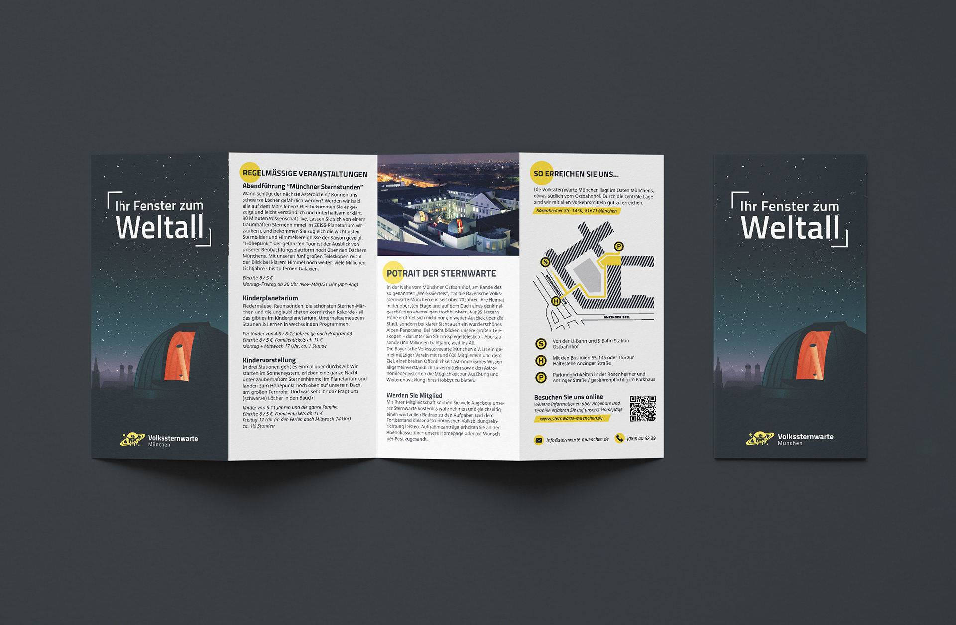
The edges around this object are framed by lines, which symbolize, according to the slogan "Your Window to the Universe," a window that grants visitors a new view of our sky. This element was also incorporated into the design of the flyers' cover.